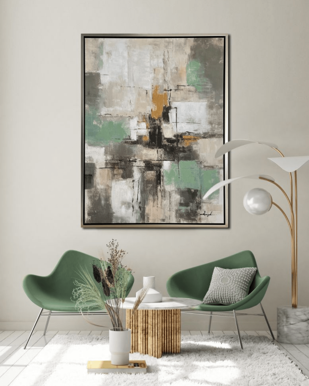
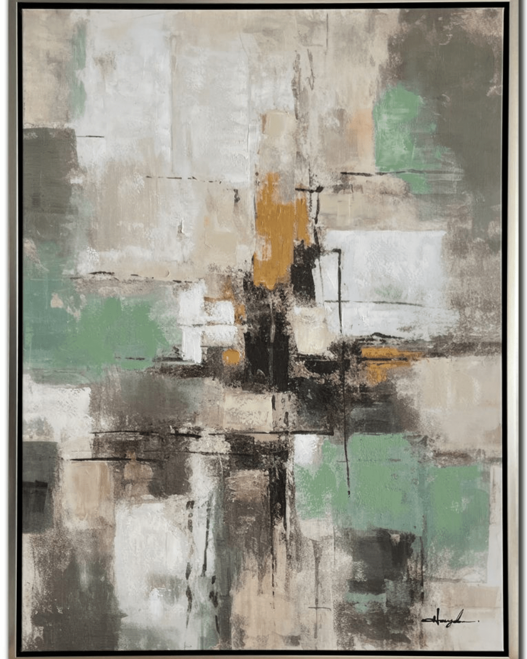
“Touch of Green” is a striking abstract painting that exudes elegance and sophistication through its masterful use of color, texture, and composition. This piece, measuring 36×48 inches, is presented on a hand-embellished canvas, which adds depth and texture to its surface, making it more than just a flat visual experience—it invites the viewer to explore its intricacies up close. The champagne floating frame enhances its refined appearance, complementing the painting’s color palette and allowing it to stand out as a statement piece in any space.
Color Palette and Mood
One of the most captivating elements of Touch of Green is its harmonious blend of light green, golds, blacks, and taupes. These colors work together to create a sense of balance and movement, evoking feelings of tranquility and warmth.
- Light Green: The soft, airy greens suggest renewal, growth, and nature’s gentle presence. This hue adds a sense of serenity to the painting, making it an ideal piece for spaces meant to inspire relaxation, such as living rooms or offices.
- Golds: The inclusion of gold tones brings a sense of luxury and opulence. Whether subtly blended or used in bold strokes, the gold elements catch light beautifully, giving the piece a dynamic, almost luminous quality.
- Blacks: The black accents create contrast and definition, providing an anchor for the more ethereal shades. They introduce a sense of depth and grounding, preventing the painting from feeling overly light or diffuse.
- Taupes: The neutral taupes act as a bridge between the other colors, ensuring a cohesive and well-balanced composition. This subtle color choice allows the painting to be versatile, complementing various interior styles from modern to classic.
Composition and Texture
As an abstract painting, Touch of Green does not adhere to a rigid structure, which allows for an open interpretation. The colors seem to flow and blend effortlessly, as if caught in a natural dance of movement and energy. The hand-embellished canvas adds texture, making certain areas of the painting slightly raised, offering a tactile quality that enhances its depth and dimension. This technique also ensures that each piece is unique, even if similar versions exist.
The layering of colors and brushstrokes suggests organic forms and natural landscapes, with hints of foliage, mist, or even reflections of light on water. The movement within the painting, whether through sweeping gestures or controlled drips of paint, gives it a sense of fluidity and spontaneity.
The Impact of the Champagne Floating Frame
The choice of a champagne floating frame plays a crucial role in elevating the artwork’s overall presence. Unlike traditional frames that can sometimes feel heavy or imposing, a floating frame creates the illusion that the artwork is suspended, allowing its edges to breathe. The champagne color—a delicate blend of soft gold and silver tones—complements the golden hues in the painting while maintaining a neutral elegance. This framing choice enhances the artwork’s modern appeal and ensures it can blend seamlessly into both contemporary and classic interiors.
Versatility in Interior Design
Touch of Green is highly versatile when it comes to styling and placement. The combination of warm golds, soft greens, and neutral taupes makes it an excellent choice for a variety of design aesthetics, including:
- Modern Minimalism: The painting’s abstract nature and clean color palette work well in a minimalist space, adding a touch of visual interest without overwhelming the room.
- Luxury and Glam: The gold accents provide an element of sophistication, making it a perfect choice for elegant settings with metallic décor and plush furnishings.
- Nature-Inspired Spaces: The light green and taupe tones evoke natural elements, making this artwork a stunning addition to spaces that incorporate indoor plants, natural textures, or earthy tones.
- Corporate or Professional Settings: Due to its balanced color scheme and abstract nature, this painting can enhance offices, lobbies, or conference rooms by adding a touch of refined creativity.
Artistic Interpretation and Emotional Connection
Touch of Green Abstract art is unique in that it allows each viewer to bring their own emotions and interpretations to the piece. Some may see Touch of Green as a representation of nature’s tranquility, with the greens symbolizing leaves in the wind or sunlight filtering through trees. Others may perceive it as an expression of movement and energy, where the blend of colors represents shifting seasons or changing moods.
Additionally, the presence of black within the painting adds an interesting contrast, possibly hinting at the interplay between light and shadow, chaos and calm, complexity and simplicity. This duality can make the painting feel dynamic yet soothing at the same time.
Final Thoughts
Touch of Green is more than just a decorative piece—it is an artistic statement that embodies balance, elegance, and emotion. Its hand-embellished texture, well-thought-out color palette, and sophisticated framing make it a standout addition to any art collection. Whether displayed in a home, office, or gallery, this Touch of Green painting has the ability to transform a space, offering a sense of peace, inspiration, and timeless beauty.
The Touch of Green painting’s abstract nature invites endless interpretations, making it a conversation starter and a deeply personal piece for any viewer. With its light greens, shimmering golds, deep blacks, and grounding taupes, Touch of Green is a true testament to the power of abstract art to evoke emotion, complement diverse spaces, and provide a timeless sense of artistic sophistication.